|
Sector Model
|
XLE
|
3.04%
|
|
|
Full Model
|
Date
|
Return
|
Days
|
|
DRQ
|
5/15/2015
|
-16.02%
|
156
|
|
INT
|
7/7/2015
|
-16.79%
|
103
|
|
BT
|
8/11/2015
|
-7.85%
|
68
|
|
TM
|
8/12/2015
|
-3.91%
|
67
|
|
MMP
|
9/4/2015
|
-0.73%
|
44
|
|
CPK
|
9/8/2015
|
13.12%
|
40
|
|
ED
|
9/17/2015
|
5.46%
|
31
|
|
WEC
|
9/30/2015
|
4.26%
|
18
|
|
UNP
|
10/7/2015
|
-0.48%
|
11
|
|
ORA
|
10/12/2015
|
3.27%
|
6
|
|
(Since
5/31/2011)
|
|||
|
S&P
|
Annualized
|
9.88%
|
|
|
Sector Model
|
Annualized
|
19.30%
|
|
|
Full Model
|
Annualized
|
13.00%
|
|
|
S&P
|
Total
|
51.14%
|
|
|
Sector Model
|
Total
|
116.77%
|
|
|
Full Model
|
Total
|
70.84%
|
|
|
Sector Model
|
Advantage
|
9.42%
|
|
|
Full Model
|
Advantage
|
3.11%
|
|
|
Previous
|
2015
|
||
|
S&P
|
53.06%
|
-1.25%
|
|
|
Sector Model
|
142.84%
|
-10.74%
|
|
|
Full Model
|
101.13%
|
-15.06%
|
Apologies for the scarce reports lately. A lot has been happening in the real world.
In any case, a few graphs.
Sector Model is hovering along the median regression line –
annoyingly normal.
Next, the Sector Ratios, strongly in bearish territory.
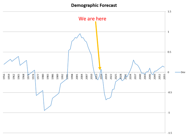
I’ve mentioned the demographic problems we face. We have a
lot of people retiring and a lot of aborted babies not taking their place in
the workforce. The following chart is the standard deviation channels of the
S&P/M1 money supply against the birthrate plus 46 years (i.e. the average
age of the workforce).
The correlations are strong, which brings us to the bad news
– minus another round of QE, the demographic forecasts show a sharp bear market
from 2016 to 2019 – with an even steeper negative slope than the 2008 bear
market.
My guess is that we’ll get more QE, but that’s ultimately up
to Janet Yellen.
Tim


No comments:
Post a Comment