The Full Model sold DNR and bought MPEL with a 2% favorable gap.
Wednesday, February 25, 2015
Sunday, February 22, 2015
2/22/2015 More, or Less?
|
Sector Model
|
XLU
|
-1.87%
|
|
Full Model
|
Date
|
Return
|
|
ESI
|
8/4/2014
|
-42.28%
|
|
EDU
|
10/27/2014
|
-10.47%
|
|
UVV
|
12/2/2014
|
19.51%
|
|
JOY
|
12/8/2014
|
-12.81%
|
|
RS
|
12/11/2014
|
-5.65%
|
|
GNW
|
1/20/2015
|
9.45%
|
|
AGCO
|
1/23/2015
|
13.98%
|
|
DNR
|
2/4/2015
|
4.09%
|
|
ALB
|
2/10/2015
|
6.39%
|
|
ISBC
|
2/17/2015
|
-0.17%
|
|
(Since 5/31/2011)
|
||
|
S&P
|
Annualized
|
12.83%
|
|
Sector Model
|
Annualized
|
24.07%
|
|
Full Model
|
Annualized
|
21.36%
|
|
S&P
|
Total
|
56.88%
|
|
Sector Model
|
Total
|
123.53%
|
|
Full Model
|
Total
|
105.86%
|
|
Sector Model
|
Advantage
|
11.24%
|
|
Full Model
|
Advantage
|
8.53%
|
|
Previous
|
2015
|
|
|
S&P
|
53.06%
|
2.50%
|
|
Sector Model
|
122.60%
|
0.42%
|
|
Full Model
|
101.13%
|
2.35%
|
Both models are positive for the year, but trailing the
S&P.
The Sector Model is well ahead of both benchmark and the
S&P since the time the STAR fund was launched at www.folioinstitutional.com.

Ahead?
Behind?
Just depends on whether you are looking back for the full
run or just the last few weeks.
I say this, because as a human being, it annoys the smack
out of me to have a bad month, week, day, or even an hour. The smaller the time frame you look in, the
more manic depressive it becomes.
For any investor it is important to stand back and look at
the numbers as a computer does, rather than as a human.
Computers can look at the entire period, the benchmarks, and
the trends. Humans hyperbolically
discount time. We’d rather have that
piece of chocolate cake now than be thin later. We’d rather have that cigarette
now than healthy lungs later.
The best representation of this is the now famous Marshmallow test. The
kids are offered one marshmallow now, or two later. Most kids cannot compare two later to one now
– and so they eat one now.
Less is more, if it is sooner in time.
More is less, if it is greater in time.
Hence Warren Buffet could have awesome decades, and a bad
week – and everyone will think he’s done.
If you’re human, look at your plan from a distance and get
rid of the caveman noise screaming between your ears. If you outperform, make sure it’s for longer
periods instead of shorter ones. If you
can do both, even better. But if you
have to choose one: pick the one you like the least – the longer time frame.
Tim
Tuesday, February 17, 2015
Sunday, February 15, 2015
2/15/2015 Conclusion: the S&P Without QE
All of this brings to the mind the question: so just how big was the 2009-2015 "bull market" if you discount quantitative easing?
It's more of a dead cat bounce than a bull market.
If you freeze the money supply at the same level it was in March 2009, then the current level of the S&P would be 1156.

My point in all of this is that a market that has never really gone up can hardly be primed for a crash. It is not long overdue for a bear market; it's long overdue for a true bull market.
It's more of a dead cat bounce than a bull market.
If you freeze the money supply at the same level it was in March 2009, then the current level of the S&P would be 1156.
My point in all of this is that a market that has never really gone up can hardly be primed for a crash. It is not long overdue for a bear market; it's long overdue for a true bull market.
2/15/2015 What About William Devane?
Just to make things a bit clearer, I’ve adjusted Shiller’s
“real price” by M1 money supply instead of the consumer price index, and
graphed the values in terms of a standard deviation channel.
The key take-away is that we are not wildly overvalued, but
rather slightly undervalued.
The market can always find a reason to crash, but I do want
to point out that there is nothing from “price” that screams that it has to do
so.

I’ve circled the current 2009-2015 real price movements to
show that it’s more of a “baloney market” than a “bull market.”
The Fed did what it felt it had to do to fight
deflation. But let’s not ignore how
those massive increases in money supply distort prices.
Given all the Fed action, the market has done very little.
The most one can truly say about the market is that it
stayed relatively flat in terms of actual value. This has been a long secular bottom.
No true bull market has even begun – yet.
And inflation? See
all those gold commercials? What about
that?
Well, if you create a standard deviation channel of M1 (money
supply) divided by CPI (inflation), then you do see that we are wildly loose on
money:

Normally when you hit 2 standard deviations you are due for
a reversal.
Janet Yellen may be looking at something like this in her
own calculations that – come hell or high water – quantitative easing must end. If it doesn’t, inflation is 100% certain
(whereas now it is only 95% certain).
But the question remains: when? The more William Devane tries to sell gold,
the cheaper it gets.
To answer that question we’ll go back to our old crystal
ball, demographics. Using Ned Davis' observation that the real price of
the S&P tracks the birth rate 46 years previous, I’ve noted a number of
times that Ned’s model breaks in 2009 when quantitative easing was introduced.
But if we use M1 instead of CPI, as we are doing here, then
his model stays intact:

The birth rate + 46 years is just a measure of how big the
United States workforce is relative to the rest of the population (i.e. the
average worker starts in the 20s and ends by the 70s). The market is the S&P divided by M1. Put both in a standard deviation channel and
they match up rather nicely.
And yes (for all you doomsayers out there), this chart does
indeed show that the market isn’t quite finished with its trouble. The demographics don’t start to improve until
the end of this decade. We are due
another bear in the next few years. But
that bear will not likely be another 2000 or 2007 collapse. We are not wildly over-valued like we were
then. Instead, the next bear – when it
comes – will most likely be one of those annoying, but not apocalyptic, events.
Happy Days are not here again – not yet.
But the grand reign of market terror is done. And William Devane? None of this matters to him because he's not an investor; he's an actor. He isn't making money from gold, but from his advertisement fees. He'll be just fine, even while gold goes nowhere...
Tim
Saturday, February 14, 2015
2/14/2015 The Bear Market That You Never Noticed
|
Sector Model
|
XLU
|
-2.99%
|
|
|
Full Model
|
Date
|
Return
|
Days
|
|
ESI
|
8/4/2014
|
-47.03%
|
194
|
|
EDU
|
10/27/2014
|
-15.93%
|
110
|
|
UVV
|
12/2/2014
|
16.88%
|
74
|
|
JOY
|
12/8/2014
|
-14.09%
|
68
|
|
RS
|
12/11/2014
|
-9.92%
|
65
|
|
JNPR
|
1/5/2015
|
6.19%
|
40
|
|
GNW
|
1/20/2015
|
18.77%
|
25
|
|
AGCO
|
1/23/2015
|
12.45%
|
22
|
|
DNR
|
2/4/2015
|
0.46%
|
10
|
|
ALB
|
2/10/2015
|
4.70%
|
4
|
|
(Since 5/31/2011)
|
|||
|
S&P
|
Annualized
|
12.71%
|
|
|
Sector Model
|
Annualized
|
23.83%
|
|
|
Full Model
|
Annualized
|
20.97%
|
|
|
S&P
|
Total
|
55.89%
|
|
|
Sector Model
|
Total
|
120.99%
|
|
|
Full Model
|
Total
|
102.61%
|
|
|
Sector Model
|
Advantage
|
11.12%
|
|
|
Full Model
|
Advantage
|
8.25%
|
|
|
Previous
|
2015
|
||
|
S&P
|
53.06%
|
1.85%
|
|
|
Sector Model
|
122.60%
|
-0.72%
|
|
|
Full Model
|
101.13%
|
0.73%
|
The Full Model is ahead of the Sector for the year, after an
annoying week in utilities:

The Sector Model remains well ahead of the benchmark, but
the sector tracking is behaving in a very strange way, similar to how the model
behaved just before the Lehman Brothers collapse: the sectors are rotating in reverse order.

Behind the scenes the money-flow has moved backwards since I
last posted them the first
weekend of December.
At that point we were looking at the possibility of a blow
off top in materials and energy. But
energy never hit the buy zone and the model started unwinding from the end of a
bull, to the beginning of a bull and even further back to a late bear
configuration.
This is similar to the behavior in the summer of 2008 when
the model moved from a late bear back to a market top.
In 2008 the action warned of a bear drop just beginning
instead of one nearing its end.
This year the action is pointing to the possibility of a
rather aggressive rise – even perhaps a dose of irrational exuberance.
We’ll have to wait and see.
I don’t time the market, but I do share the same fascination with timing
that other investors have. We’ve all
watched in wonder at a market that outperformed a stagnant economy. It could be that we are getting close to an
actual recovery that doesn’t need to be faked by the Fed.
On a more granular level, let’s take a look at the specific
industries being favored by the Full Model:
|
EDUC
|
Bottom
|
|
INSLIFE
|
Bottom
|
|
THRIFT
|
Bottom
|
|
CHEMDIV
|
Bull
|
|
COAL
|
Bull
|
|
HEAVYTRK
|
Bull
|
|
OILPROD
|
Bull
|
|
PUBLISH
|
Bull
|
|
STEEL
|
Bull
|
|
TOBACCO
|
Bear
|
|
UTILCENT
|
Bear
|
In the first column I have the industries in the buy zone
for the model. In the second column I
have an estimate of the most typical market placement for that industry on the
model.
Other than Tobacco and Utilities, the industries are heavily
bullish. Granted, Insurance-Life and
Thrift are typical of the tag end of a bear going into a bottom, but that’s
close enough to a bottom to call it one in light of the other stocks.
The puzzle for most folks is, “how can we have a bottom
after such a long bull market?”
Shiller’s Cyclically Adjusted Price to
Earnings ratio is showing a nosebleed reading against CPI of 27.60! That’s even higher than it was before the
2007-2009 market collapse.
First a chart of Shiller’s real price:

Well above trendline.
Now Shiller’s CAPE ratio:
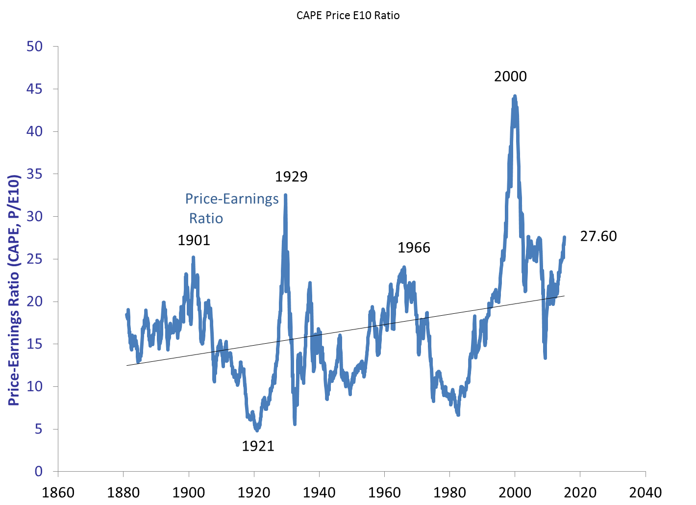
Well into pre-crash territory.
I’ve noted this in the past, and will note again: Shiller’s
CAPE ratio only deals with real return expectations – not nominal return
expectations. Over the next decade
Shiller’s chart indicates an expectation of about 1-2% real returns, with a
likely crash during that decade (according to analysts like John Hussman).
But that’s neglecting to take into account Quantitative
Easing.
You don’t need a market crash to pull down real
returns. Inflation will do that
too. This market does not resemble 1929,
1999, or 2007 when you take QE into account.
The nearest monetary parallel is 1972, after Nixon had bought his
re-election by coercing the Fed to be too easy with monetary policy.
Quantitative Easing has been no secret, but the effects are
not taken into account in Shiller’s data.
If we adjust prices by M1 instead of CPI, we see that there has been no
bull market at all, but rather a long stagnation along a secular bottom:

In terms of CAPE we still have an inflated value, but not a
pre-crash level – of 18.36:

If there has been no bull market, there is nothing to crash.
Again, bull and bear markets cannot be predicted with any
certainty. But claims of an aging bull
market fail to acknowledge that in terms of money supply there has been no
2009-2015 bull market. Instead there was
a tiny bull from 2009-2011, followed by a tiny bear from 2011-2013, followed by
another tiny bull from 2013 to today.
Let’s zoom in a bit to see it:

That, ladies and gentlemen, is what happens when the Fed
pulls a rabbit out of a hat. It’s just a
bit of sleight of hand in terms of market levels. When you filter out Quantitative Easing, the
peak from 2009 through 2015 was actually in December of 2011. We had a diluted bear market, followed by a
slow recovery that has not yet reached 2011 valuations.
So, to all of those screaming about being overdue for a
bear, I have this to say: we already had that bear in 2012
and you didn’t see it because of smoke and mirrors.
Tim
Subscribe to:
Posts (Atom)