|
Sector Model
|
XLU
|
-2.99%
|
|
|
Full Model
|
Date
|
Return
|
Days
|
|
ESI
|
8/4/2014
|
-47.03%
|
194
|
|
EDU
|
10/27/2014
|
-15.93%
|
110
|
|
UVV
|
12/2/2014
|
16.88%
|
74
|
|
JOY
|
12/8/2014
|
-14.09%
|
68
|
|
RS
|
12/11/2014
|
-9.92%
|
65
|
|
JNPR
|
1/5/2015
|
6.19%
|
40
|
|
GNW
|
1/20/2015
|
18.77%
|
25
|
|
AGCO
|
1/23/2015
|
12.45%
|
22
|
|
DNR
|
2/4/2015
|
0.46%
|
10
|
|
ALB
|
2/10/2015
|
4.70%
|
4
|
|
(Since 5/31/2011)
|
|||
|
S&P
|
Annualized
|
12.71%
|
|
|
Sector Model
|
Annualized
|
23.83%
|
|
|
Full Model
|
Annualized
|
20.97%
|
|
|
S&P
|
Total
|
55.89%
|
|
|
Sector Model
|
Total
|
120.99%
|
|
|
Full Model
|
Total
|
102.61%
|
|
|
Sector Model
|
Advantage
|
11.12%
|
|
|
Full Model
|
Advantage
|
8.25%
|
|
|
Previous
|
2015
|
||
|
S&P
|
53.06%
|
1.85%
|
|
|
Sector Model
|
122.60%
|
-0.72%
|
|
|
Full Model
|
101.13%
|
0.73%
|
The Full Model is ahead of the Sector for the year, after an
annoying week in utilities:

The Sector Model remains well ahead of the benchmark, but
the sector tracking is behaving in a very strange way, similar to how the model
behaved just before the Lehman Brothers collapse: the sectors are rotating in reverse order.

Behind the scenes the money-flow has moved backwards since I
last posted them the first
weekend of December.
At that point we were looking at the possibility of a blow
off top in materials and energy. But
energy never hit the buy zone and the model started unwinding from the end of a
bull, to the beginning of a bull and even further back to a late bear
configuration.
This is similar to the behavior in the summer of 2008 when
the model moved from a late bear back to a market top.
In 2008 the action warned of a bear drop just beginning
instead of one nearing its end.
This year the action is pointing to the possibility of a
rather aggressive rise – even perhaps a dose of irrational exuberance.
We’ll have to wait and see.
I don’t time the market, but I do share the same fascination with timing
that other investors have. We’ve all
watched in wonder at a market that outperformed a stagnant economy. It could be that we are getting close to an
actual recovery that doesn’t need to be faked by the Fed.
On a more granular level, let’s take a look at the specific
industries being favored by the Full Model:
|
EDUC
|
Bottom
|
|
INSLIFE
|
Bottom
|
|
THRIFT
|
Bottom
|
|
CHEMDIV
|
Bull
|
|
COAL
|
Bull
|
|
HEAVYTRK
|
Bull
|
|
OILPROD
|
Bull
|
|
PUBLISH
|
Bull
|
|
STEEL
|
Bull
|
|
TOBACCO
|
Bear
|
|
UTILCENT
|
Bear
|
In the first column I have the industries in the buy zone
for the model. In the second column I
have an estimate of the most typical market placement for that industry on the
model.
Other than Tobacco and Utilities, the industries are heavily
bullish. Granted, Insurance-Life and
Thrift are typical of the tag end of a bear going into a bottom, but that’s
close enough to a bottom to call it one in light of the other stocks.
The puzzle for most folks is, “how can we have a bottom
after such a long bull market?”
Shiller’s Cyclically Adjusted Price to
Earnings ratio is showing a nosebleed reading against CPI of 27.60! That’s even higher than it was before the
2007-2009 market collapse.
First a chart of Shiller’s real price:

Well above trendline.
Now Shiller’s CAPE ratio:
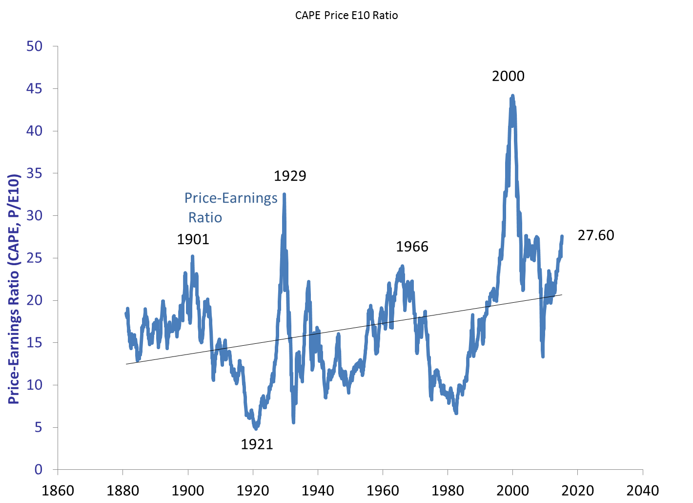
Well into pre-crash territory.
I’ve noted this in the past, and will note again: Shiller’s
CAPE ratio only deals with real return expectations – not nominal return
expectations. Over the next decade
Shiller’s chart indicates an expectation of about 1-2% real returns, with a
likely crash during that decade (according to analysts like John Hussman).
But that’s neglecting to take into account Quantitative
Easing.
You don’t need a market crash to pull down real
returns. Inflation will do that
too. This market does not resemble 1929,
1999, or 2007 when you take QE into account.
The nearest monetary parallel is 1972, after Nixon had bought his
re-election by coercing the Fed to be too easy with monetary policy.
Quantitative Easing has been no secret, but the effects are
not taken into account in Shiller’s data.
If we adjust prices by M1 instead of CPI, we see that there has been no
bull market at all, but rather a long stagnation along a secular bottom:

In terms of CAPE we still have an inflated value, but not a
pre-crash level – of 18.36:

If there has been no bull market, there is nothing to crash.
Again, bull and bear markets cannot be predicted with any
certainty. But claims of an aging bull
market fail to acknowledge that in terms of money supply there has been no
2009-2015 bull market. Instead there was
a tiny bull from 2009-2011, followed by a tiny bear from 2011-2013, followed by
another tiny bull from 2013 to today.
Let’s zoom in a bit to see it:

That, ladies and gentlemen, is what happens when the Fed
pulls a rabbit out of a hat. It’s just a
bit of sleight of hand in terms of market levels. When you filter out Quantitative Easing, the
peak from 2009 through 2015 was actually in December of 2011. We had a diluted bear market, followed by a
slow recovery that has not yet reached 2011 valuations.
So, to all of those screaming about being overdue for a
bear, I have this to say: we already had that bear in 2012
and you didn’t see it because of smoke and mirrors.
Tim
Hi Tim,
ReplyDeleteThere is something I don’t quite understand. You wrote: ‘You don’t need a market crash to pull down real returns. Inflation will do that too’. This part is clear to me but then you continue by saying that QE has a similar effect and then you mention M1. I can’t see what M1 has to do with QE. The money that de Fed supplied did not get as far as the ATM-machines and the wallets of the public, and that is M1, isn’t it? The Fed’s new money has stayed on the books of the banks, if I understand QE correctly.
The next thing that I’m puzzling over is a technical problem: how do you get to the final graph in which the Shiller P/E is at 18.36? What is the math that leads to this result?
Third: at the end of the day you still have to acknowledge that someone who invested $1000 in SPY in March 2009 now has about $3000. That is real money since inflation has been rather low throughout this period. In your graph it seems the value of this portfolio hardly moved up at all. What is the point of looking at S&P-levels through the M1-glasses when you get paid in the same kind of money as the one you used for your investments 5 years ago?
Regards,
Wil
Hi Will,
ReplyDeleteIf you look at the M1 chart at http://research.stlouisfed.org/fred2/series/M1 you can see that the sudden spike of M1 corresponds to the period of QE. Even though QE was not direct money printing per se, it does shift assets in a way that allowed M1 to grow by indirect means. They’ll claim otherwise, but all we peons have to do is compare QE and M1 to see it.
The Shiller-M1 CAPE of 18.36 is achieved by replacing Shiller’s CPI adjustment with M1 instead.
My point is that such a rise without QE might be screaming for a crash, the same nominal rise with QE is not.
The disconnect is not M1 and S&P, but rather CPI and S&P: which translates into the source of the disconnect as M1 and CPI. That is, we printed a lot of money and haven’t had any inflation yet.
Because of demographics I don’t expect us to have any appreciable inflation in the near future, either.
But even though Bernanke was able to do QE without immediate inflation, it will have to eventually be reversed – almost certainly beginning by the end of this decade.
That means two things so far as stock returns and taxes. First, we had great stock returns without inflation, but still had to pay a lot of taxes. Second, we’ll likely have poor stock returns and inflation in the future. In the end it’s likely a wash. Your portfolio from 2009 to 2029 will probably be exactly the same after QE and a QE reversal as it would have been with no QE at all.
The purpose of QE, then, was not to affect your long term stock returns, but instead to prevent a crash far worse than the one we had in 2009. In other words, QE prevented the very crash that so many pundits are scared of now. By showing the S&P divided by M1 on that last graph on the 15th, I wasn’t trying to show that 1000 to 3000 isn’t real profit, but instead I was trying to show how the crash everyone seems to fear is an illusion. We had a little bull market, a little bear market, and another little bull – all lifted by QE. The profit from 1000 dollars to 3000 that you spoke of wasn’t because of a steamroll of euphoria, but rather a shift in assets courtesy of Bernanke. Those assets will not be pulled away with the same urgency they were printed, but will most likely stop in this decade and then pull back in the next.
Tim